You’ve developed a marketing plan, have chosen an ecommerce platform to host your subscription box storefront, and are in the stages of building your website. Congratulations! That’s an exciting place to be in.
But there’s one thing that we need to tackle before you can successfully release your website – and thus, your business – to the world. Actually, two things.
About Us and FAQ pages are crucial steps in a customer’s process from discovering your business to subscribing (in other words, your conversion funnel). Visitors have ended up on your website because they’re looking to fulfill a particular need, so it’s important to show what makes your brand special – and how it benefits subscribers – during this initial research phase. Webpages that explain your company story and any common customer queries do immeasurable work to help your business stand out… and persuade your site visitor to give you their email at the very least.
Today, we’ll dive into the essentials: what makes a successful About page and FAQ, as well as tips to maximize your visitor engagement.
The “About Us” Page

This is a key component of any professional website, whether you’re a freelancer, a one-person subscription biz, or have a team of dozens. Without an About page, potential customers have no way of understanding the ethos (that is, credibility and collective identity) of your company or the people behind it. And without that, you won’t earn customers.
What to include in an “About Us” page
Because About pages are so common, it may be easier to consider what doesn’t belong on one. Think about the many business websites you’ve been on over the years. For that matter, consider your competitors’ websites. What stood out to you, positively or negatively? Did anything stand out by its absence?
The main elements you need to include on an About page are your mission, values, team, and origin story. This allows your potential subscribers to understand what drives your company and how your business aligns with their interests, needs, and goals.
Here are some basic tips on what else to include on your About page – and how to optimize them.
Your page title should be straightforward.
Now is not the time to get quirky with your titling, like “What Makes Us Tick” or “The Chamber of (Trade) Secrets.” A basic “About,” “About Us,” or “Meet Our Team” is sufficient to get the message across and makes you look much more professional.
Show the people behind your brand.
There’s a reason so many businesses, from universities to dental offices to ecommerce startups, include photos and bios of their employees on the About page. Doing so helps humanize your brand! Potential subscribers get a strong sense of the culture behind your company, which creates a (literal and figurative) face for your business. Whether you go with a group photo or individual photos, remind them that you and your team are people, not a faceless corporation.
Create a compelling narrative.
We all love hearing a good story, and that’s no different when it comes to business sites. So you might as well try to tap into what makes a story attention-grabbing!
Think about the plot elements that popular stories have in common as you try to put together your brand narrative. For instance, in the beginning, there’s usually a status quo that gets disrupted (quickly). That disruption (aka the “inciting event”) kicks off the main plot. Then there’s a series of complications – advancements and setbacks – until a milestone occurs that can’t be changed.
In your case, this milestone would likely be your business launch (or relaunch), while the “inciting event” would be the moment that inspired you to start your subscription business. So what was that? Paint readers a picture of your status quo, the “aha!” moment that changed everything, and the complications (and exciting solutions!) for your business along the way.

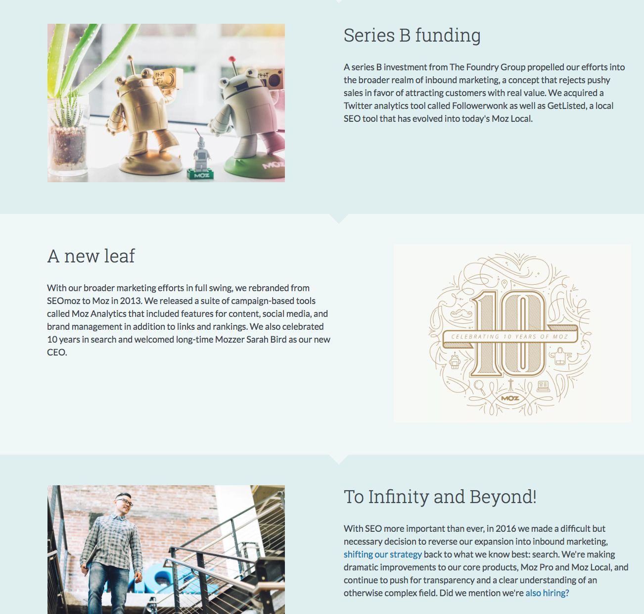
SaaS marketing business Moz illustrates all the twists and turns of its brand narrative with a modular layout. Each complication in their story – including perceived setbacks, like when they switched back from an expanded mission to their original mission – gets its own paragraph.
That being said, don’t get too fancy.
The key to strong writing is to be concise and understandable. Since you’re writing for a general (i.e. non-expert) audience, that means avoiding jargon whenever possible. Write your About Us as if you’re talking to someone… because you are.
Consider your target customer.
Discussing your target customer explicitly may be a good way to frame your brand and value proposition. After all, your goals and values as a company are inherently tied to your target audience. And if readers don’t resonate with that, they aren’t the right readers for you.

See Nike’s About page above, for example. You’re greeted immediately with this quote overlaying video clips of ordinary people playing sports or exercising. Moreover, the asterisk has a small footnote at the bottom of the screen that says “If you have a body, you are an athlete.” This sentiment encapsulates the spirit of Nike’s target audience and its values as a company.
If you can, include multimedia: video, images, or even audio.
Multimedia can create a world of good in getting your potential customers engaged. As they say, we live in a visual culture – people are inherently more drawn to (and interested in) videos and imagery than a wall of text. Including photos or video of your team can also be an awesome way to show your personality, both as a brand and as people.
Pay attention to layout.
Using a gridded or modular layout for your About page – perhaps divided by mission, values, origin story, and team bios – can help break up the text for your reader. It’s been proven that people find long chunks of text visually intimidating, and that means they’re less likely to read the whole thing.
Offering the same information in a more exciting, digestible layout helps your message get across. (On that note, do your best to balance text with whitespace!)
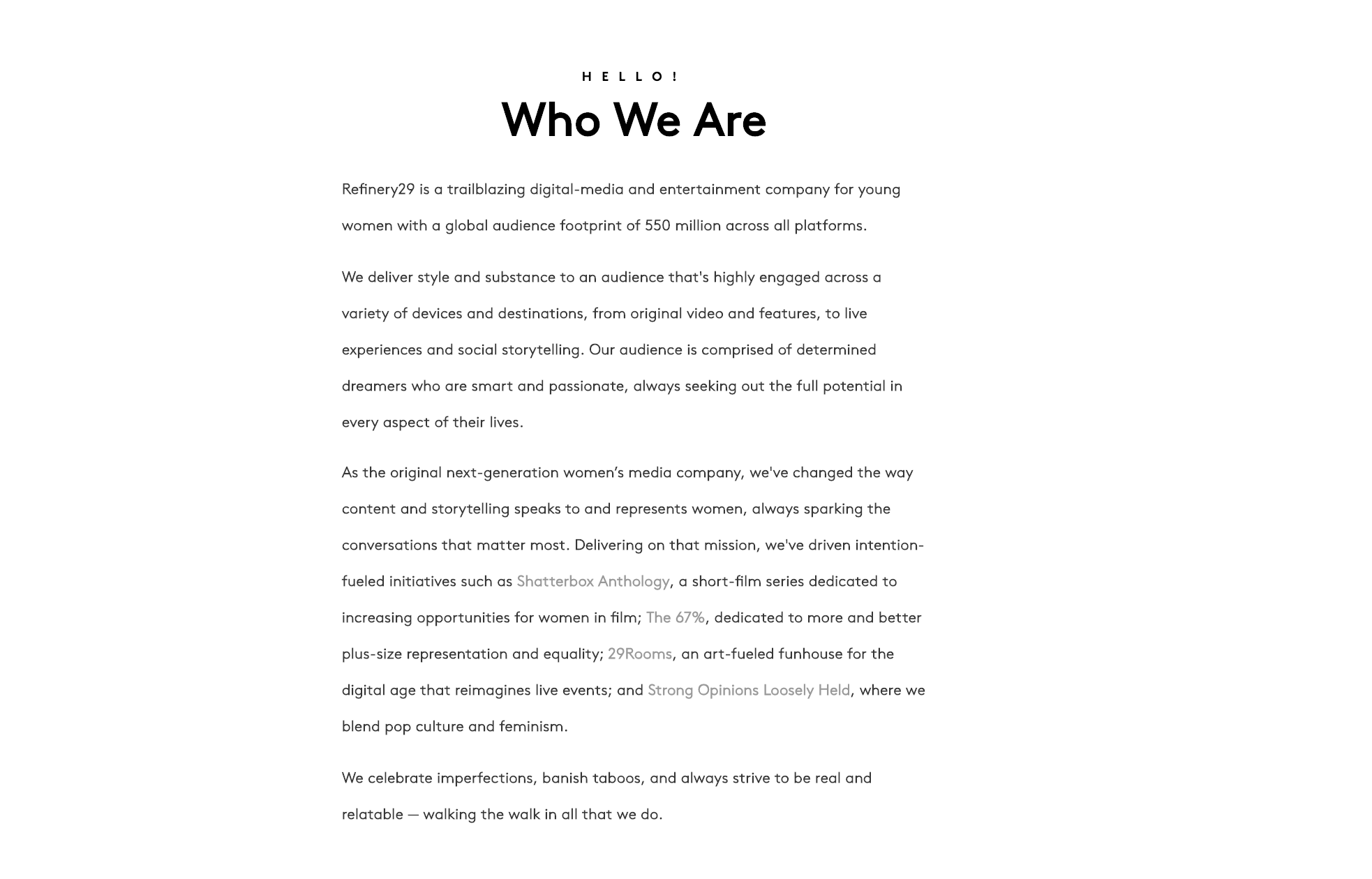
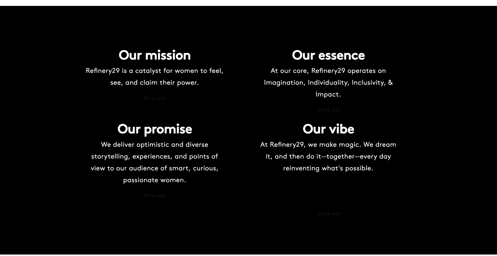
Compare these two sections of Refinery29’s About page. All of this information is important to their business, but the gridded layout on the black background stands out much more. That way, Refinery29 ensures that even if readers scroll past their introduction, they’ll absorb the key points.
Include your contact info.
If you don’t offer a separate Contact page on your website, work your contact information into the About Us. However, we suggest you position the contact email or phone address in your footer if possible, or otherwise visually separate from the rest of your information. You wouldn’t want to risk it getting lost in the shuffle!
Keep the page visually consistent with the rest of your website.
This holds true for FAQs and any other pages as well! Consistency is a key part of professional-looking design. Keep your color scheme, layout styles, language style, fonts, and everything else close enough to the aesthetic of your site overall that it feels like a smooth, coherent user experience.
Read more: Review the other principles for successful website design on our blog.
Now, let’s talk about FAQs.
The FAQ Page
![]()
The central issue with FAQ pages is that, deceptively, they seem easy. After all, the page’s organizing principle is right there in the name: Frequently Asked Questions. It’s not like an About page, where you have to decide what information to tell potential customers out of all the possible information about your business. As a small business owner, you may not have a full-fledged, in-house help center at your disposal, so your FAQ needs to be comprehensive enough for scrutiny.
In short, FAQs seem straightforward. But you’d be surprised.
How to Build an FAQ
First, put yourself in the place of your site visitor. They could be in any one of several phases in the conversion funnel: just looking, seriously interested in your subscription, or a current subscriber with a question about their service. In any case, however, they’re more likely to peruse the FAQ page in a frustrated mood than when they peruse any other page on your site. Therefore, it’s even more crucial that you clearly and succinctly answer their questions.
In general, function and user-friendliness should come first as you draft your FAQ page. Keep your purpose and potential audiences at the top of your mind!
Here are our tips for taking your FAQ from simple utility to a stellar UX achievement.
Scour your inbox, social media comments, and any reviews for potential questions.
Since the point of an FAQ page is to cover any common or anticipated questions that your subscribers may have, you shouldn’t leave any stone unturned as you decide which questions to include. Your followers, leads, and fans have likely left queries or other feedback for you on your social media pages, in your email, or on your Marketplace listing. Take note of these comments, and from what you’ve gathered, brainstorm related questions people may have. Now you’ve got an outline!
List the FAQ page in the main navigation menu.
Now is not the time for hiding in a parent-child drop-down menu. Make it as easy as possible for site guests to find your help page by including it in a header, expandable (e.g. hamburger) main menu, or sidebar navigation.
Alternatively, if you have a separate “How It Works” page, consider putting an FAQ there.
Keep in mind that this only works if your FAQ is relatively short. But if so, this could be a smart, effective use of space; it streamlines the user’s experience by packaging together an explanation of the recurring revenue model and anticipating any additional questions they may have about it.
Be wary of going overboard with information.
This is a little like the “no jargon” guideline from earlier. It’s a fine line to walk as you draft answers to common questions – you want to be clear and helpful in your answers, but you want to avoid overwhelming the potential subscriber with too much detail at the same time. If your answers are paragraphs and paragraphs long… Well, you reader has likely stopped reading.
Think seriously about organization.
How many questions do you include on your FAQ page? What order do you put them in? If you have a ton of questions, or just several around certain topics, it’s worth organizing your FAQ into categories. Grouping questions into categories works well to point your customers in a clear direction. However, you’ll still need to decide on an order for the questions in each category! For this, we recommend organizing questions in order of the process being discussed (such as billing, shipping & delivery, or placing an order).
Ask for feedback. (And update often.)
At the bottom of your FAQ page – or on a sidebar – include a blurb requesting feedback on your answers. Something like Was this helpful? If you have additional questions, reach us at [email]@[site.com]. This allows your potential customer to get resolution for a particularly difficult conundrum and has the added benefit of alerting you to any gaps in your FAQs. Use that feedback regularly to build a stronger page, and consequently, more interest in your business.
Design your layout so it’s easy to search.
In other words, avoid writing in question/answer/question/answer format all the way down the page. That only results in a lot of scrolling and skimming. More concise layouts are better for the user; those will help your visitor find exactly what they need much more quickly.
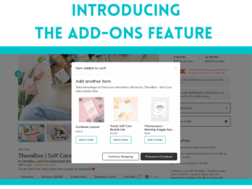
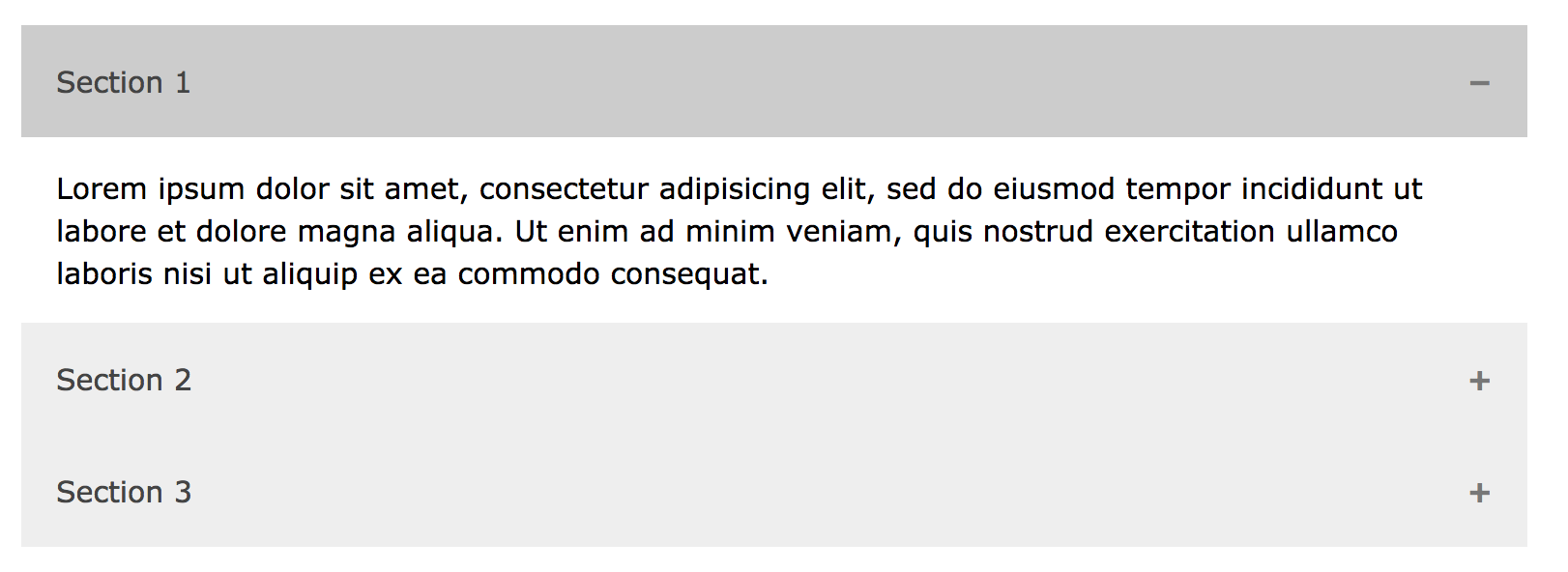
If you have the ability to install an accordion-style plugin for your FAQ, we recommend it. These allow you to display questions in a list, with small + icons or “Expand” instructions on the side of the question. Click on this directive and the text box containing your question will drop open, revealing the answer. This feature keeps the FAQ looking clean and individual questions easy to discover while adding an additional sheen of professionalism. (See below for an example.)
If that’s not an option for you, you might list all questions at the top of your FAQ page and include the answers to your questions further down the page. Set up each question as a bookmark (or “anchor”) hyperlink, so it directs your reader to the answer below.
What you’ll need to do is create a special ID tag (like <a id=”answer”> ) for each answer in the HTML code for your site. Then, when you select the text of the matching question, link it to that ID (like <a href=”#answer”> ). It may seem a little tedious, but it will do wonders for your users.
Read more: Learn how to create anchor bookmarks step-by-step at HTML.com.
In your answers, link to other pages on your site.
This is perhaps the most important tip of all, and why we saved it for last: the help you provide doesn’t stop with the FAQ. You’ve built your whole site out of information about your business, so put it to use! If a question in your FAQ relates to a subject covered at length elsewhere on your site, as it likely will, end your answer to that question with a (linked) CTA encouraging the user to check out that other page. This technique encourages your visitors to explore your site more fully, which in turn allows them to learn more about your brand, value proposition, and subscription process.
In the end….
…what matters is that your About Us and FAQ pages make sense for you and your users. So don’t feel like any of this is set in stone. Take our advice, but be open to revising as necessary when you hear feedback from your visitor community.
Good luck!