As we’ve discussed before, email marketing is one of the best ways you can extend your brand reach and convert leads into subscribers. After all, it has the highest click-to-conversion rate of any other marketing method – including social media! So you want to set up email campaigns often… and early.
Teaser campaigns do just that for your prelaunch. Set up an email drip campaign for your prelaunch mailing list and watch the conversions roll in.
Prepare Ahead of Time
The email addresses you capture from social media marketing or your prelaunch landing page do you no good if you don’t utilize them. Build a series of emails that are triggered to go out automatically (a “drip campaign”) when someone signs up for your prelaunch list. Do this before you publish your landing page, so the emails are ready to go as soon as your page – and its opt-ins for lead capture – goes live.
Why the rush? Because a lead does not a subscriber make, and these “teaser” campaigns can be a powerful strategy to encourage conversions. The most important thing you can do for a lead is to create an immediate, engaging post-signup experience. If you don’t follow through, your potential subscriber won’t either; if you wait until launch to contact them again, they’ll likely forget about you (and their interest in your subscription). And then your post-launch emails get marked as spam.
In other words, you want to reach out as soon as they sign up with an email confirmation, then send periodic emails throughout your prelaunch phase to keep leads excited and eager for your subscription.
Test it out: See how easy it can be to automate these teaser campaigns with MailChimp, Cratejoy’s recommended email service provider.
How to Structure a Teaser Campaign
Because you don’t have a released product yet, you get to pick and choose what information you show the public. This allows you some flexibility to have fun with what you reveal – and with your layout. Since you won’t be packing any email with a ton of information, you might as well design your email to catch the eye. Check out Canva or Piktochart to design infographics or marketing visuals easily and quickly.
Teaser campaigns work well with 5-8 emails over a series of weeks. More than that and you might get on people’s nerves; fewer and your product could fall to the back of their minds. You can organize your email campaign around whatever structure you choose, but we’ve found that the order below has led to great success in the past.
- Upon signup, automate an email to verify the lead’s address and offer an incentive only available to the mailing list.
- Follow up with a promotional email letting them know about your progress in prelaunch.
- Write the potential subscriber and encourage them to follow/engage with your social media channels or other communities. Including another incentive (such as a giveaway come launch time) works well for this.
- Send a friendly reminder about the upcoming launch. You might include a survey here to get customer feedback – you can incorporate their feedback as your subscription grows after launch, and your subscribers will feel invested in your brand’s journey.
- When your launch goes live, send out an email to formally announce your subscription.
We’ll take a look at some examples of successful teaser emails in a minute, organized with this structure in mind.
Example Teaser Campaign
Check out the sample emails below to get a clearer sense of how you might construct a strong teaser campaign. We’ve combed through campaigns from all different companies to showcase different strengths in layout and brand voice.
1. Welcome/Signup Email
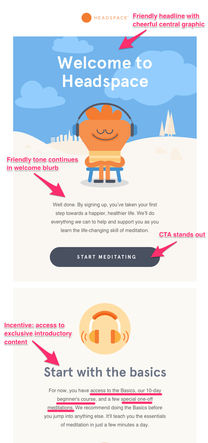
Headspace, a popular meditation & mindfulness app, does a great job framing its welcome email with eye-catching graphics. The call to action (CTA) is color-contrasting and prominently positioned underneath a friendly, casual welcome message, while their user incentive (exclusive access to Headspace’s beginner course) is impossible to miss. Both the welcome blurb and the incentive paragraph are written in a straightforward, welcoming voice.

Fonts.com takes a different tack in their email to thank the user for signing up. As you can see, this example is more accessible in terms of graphics; you don’t need a graphic designer to build this layout or catch the reader’s eye. Moreover, the headline uses their most important keywords right away – which immediately establishes the email’s intent (“Thank You for Signing Up”) and encourages the reader to scroll down to the CTA (“Your Free Fonts Are Below”).
2. Progress Email

iA Writer also uses a basic layout to great effect. Since this email is focused on letting readers in on their progress on upcoming products, they cut right to the chase with their design and promotional copy. For each version of the product, they include one sneak peek of a product feature. And importantly, they leave you wanting more with the “secret” they hint at in the last line before the CTA.
3. Social Engagement Email
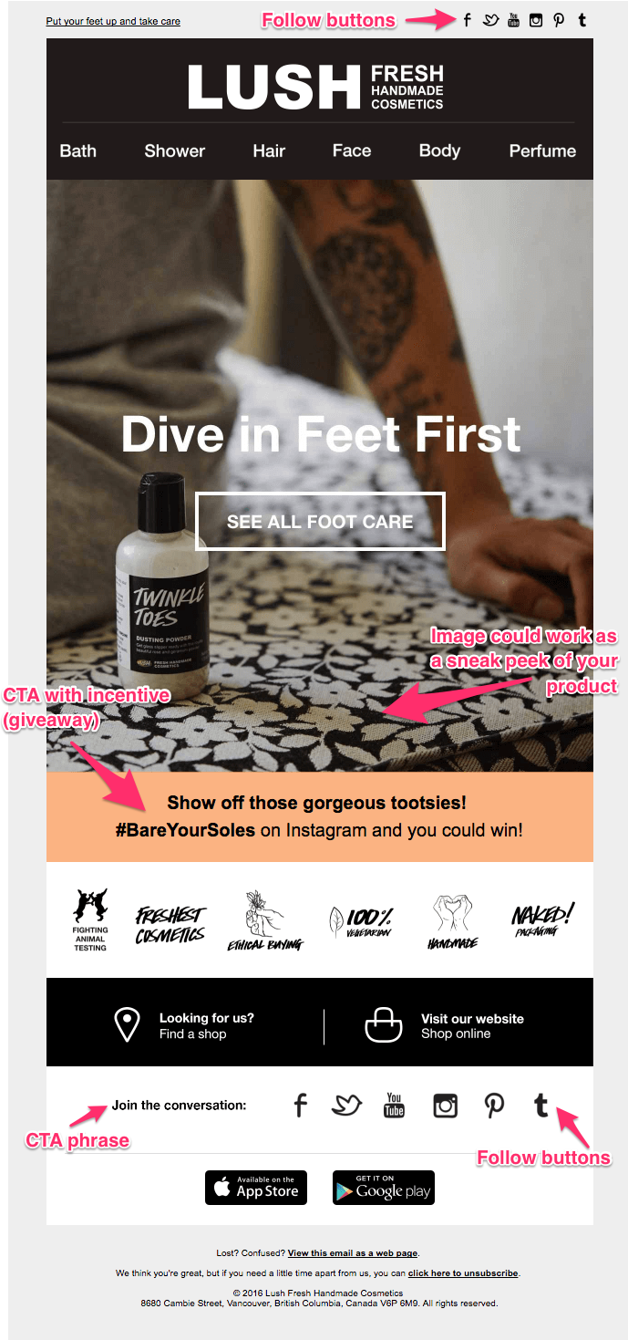
LUSH Cosmetics puts its product front and center to draw in readers. For your prelaunch, you might echo this technique by offering a sneak peek of a prototype box or featuring a specific product to be included in the first month’s box. Their call to engage on social media is specific and concrete – asking for a particular hashtag – and offers an incentive. Then LUSH doubles down on this request for engagement by including a second set of social media icons (and “Join the conversation” CTA phrase) at the bottom of the email.
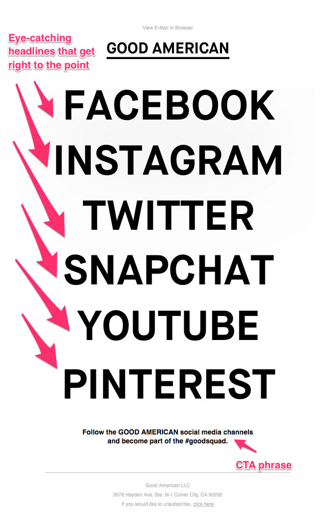
Good American, a high-end clothing company, cuts straight to the chase with this engagement email. They include a hashtag, but it’s more a suggestion than a requirement (as it is in LUSH’s email, where you must enter the hashtag to win a prize). This email design would be easy to format in any email marketing provider, or even using plaintext.
4. Reminder Email
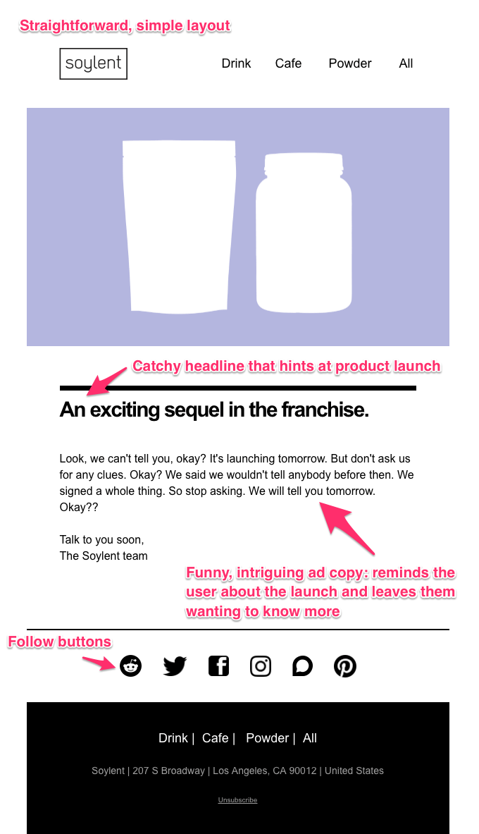
Soylent, a protein drink company, does a lot with what seems like a very basic email design. The simple layout encourages the user’s focus to fall on Soylent’s ad copy, which uses humor to tease out their product launch. The user gets a sense of the people behind this brand and is prompted to wonder more about the impending launch. Lastly, the layout also allows their social media icons to stand out prominently.
5. Launch Announcement
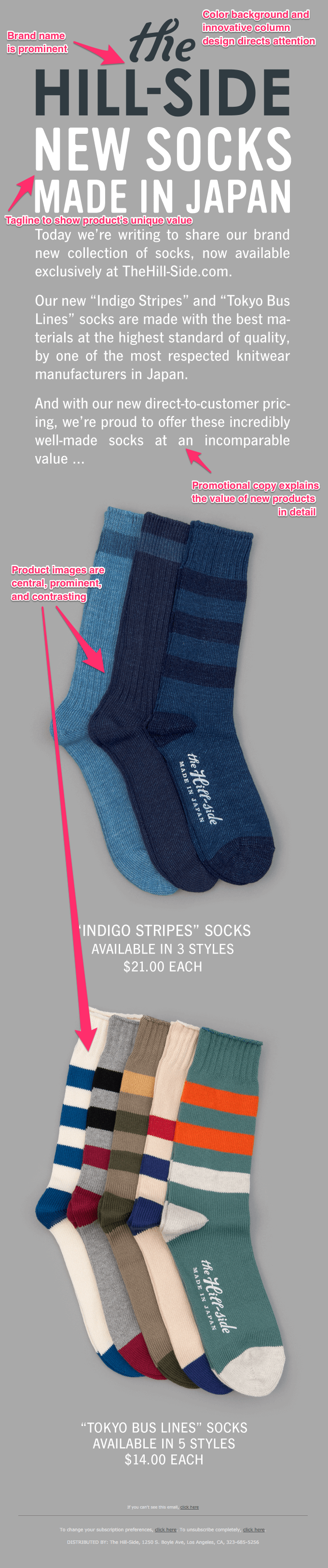
The Hill-Side puts their new products front and center here with a one-column layout, neutral color scheme, and unique fonts. The user’s attention naturally goes to the brand name and tagline (promoting “discovery” and “high quality” value propositions) above the fold, then to prominent product images below the fold.
More questions?
Check out our full guide to email marketing 101!