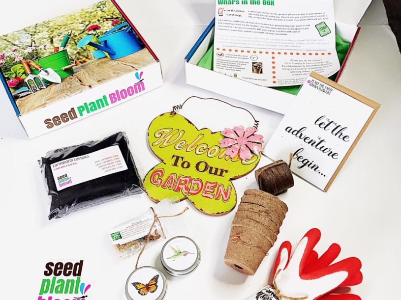
The unboxing experience is that perfect moment when a subscriber receives their box, opens it, and sees what’s inside. Beyond the initial engagement and checkout experience, this is one of the most important points in the customer journey, and in large part, helps determine the potential of churn and overall satisfaction.
A number of things factor into the unboxing experience, and one of the cornerstones of this experience comes down to the “packing list,” or list of contents.
Packing lists generally tell the subscriber what was in the box, what those items are worth, and why they were chosen. Of course, depending on the niche of your subscription, your packing list may serve a number of different roles.
As you begin to put together your first box, keep these principles in mind.
Theme: With each box, you have the opportunity to define your product offering by some specific theme or message. In your packing list, you might include a few sentences about a theme or explain to your subscribers how and why you chose the items you did.
Product descriptions: Rather than simply listing the items on a packing slip, consider writing descriptions. You can talk about the manufacturer, the specific product itself, or how it relates to the theme.
Accurate MSRPs: Dollar value can be an important thing to add to packing lists. While your value proposition to customers may not be one focused on monetary value alone, including these numbers can help customers feel like their purchase was justified – and that they’re getting a deal.
Note: If your subscription is focused on smaller, sample- or trial-sized items, MSRPs may not be applicable. (See Birchbox’s example below!)
Opportunities for CTAs: Packing lists are a huge opportunity to include an additional CTA (or call to action) in the box. You can draw attention to a referral program, points or rewards program, or simply to your social media channels.
Creating Your Custom Packing List
Designing your packing list involves deciding on several factors. Because sizes, formats, and branding vary, we’ll focus only on the very basics.
- Choose your size or format, such as a 5×7 card or brochure-style pamphlet (or something else completely)!
- Once your product sourcing has been completed, provide all product information to whoever designs your packing list.
- When designing your packing list, make sure to export it with at least 0.125” bleeds on all sides. Bleeds provide additional margin space for print shops when they cut and size your printed material. (Ask your print shop if this is needed before you size the design.)
- Approximately one week before packing that month’s boxes, make sure your design for the packing list has been finalized and submitted for proofs at your print shop of choice.
Examples of Packing Lists for Subscription Boxes
Here are some examples of packing lists for a range of subscription boxes.
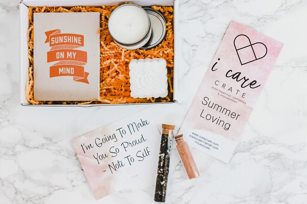
I Care Crate uses a minimalist, pretty packing slip to show off that month’s theme.
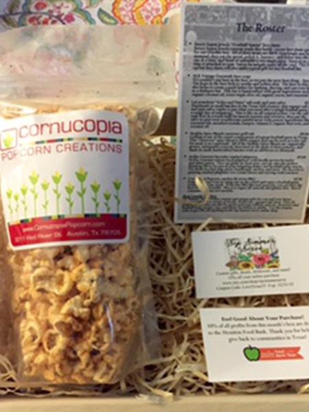
My Texas Market includes a “roster,” as seen in the top right.
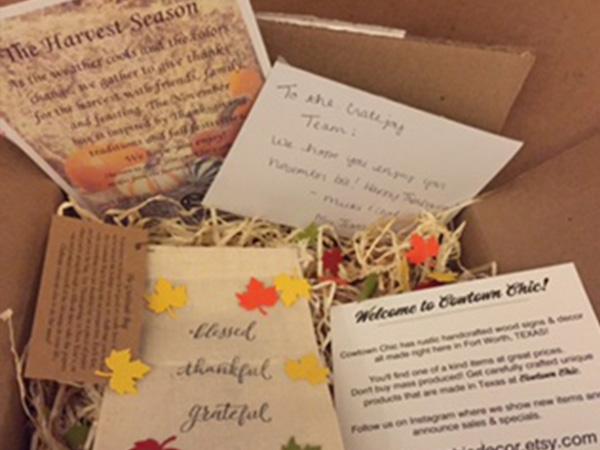
My Texas Market also includes a theme card (see top left).
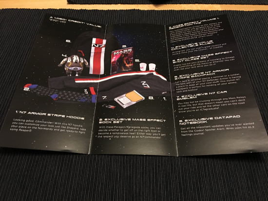
Loot Crate has included tri-fold pamphlets, with a central image surrounded by descriptions.
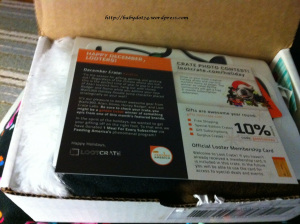
Loot Crate has also included more standard 4×6 sized cards, as seen above.
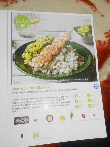
Hello Fresh includes packing lists on their recipe cards for easy reference.
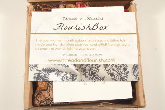
Thread and Flourish includes a postcard-sized packing list atop the products in each box.
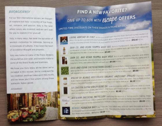
Escape Monthly uses tri-fold pamphlets, with a theme description on the left and product descriptions on the right.
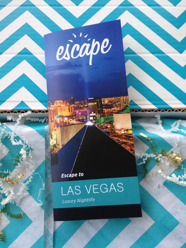
The cover of the Escape Monthly pamphlet also profiles that month’s exciting destination.
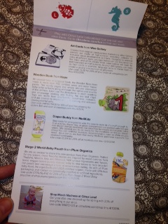
Citrus Lane provides a vertical-fold packing list, with a standard postcard size.
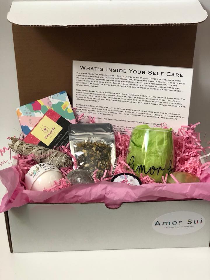
Amor Sui provides a standard white paper with a clear headline and detailed descriptions of the box contents.
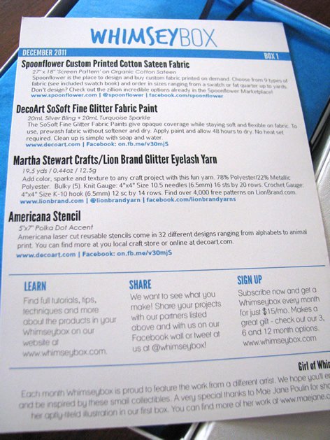
Whimsey Box included a packing list at the top, CTAs in the bottom center, and a description on the bottom.
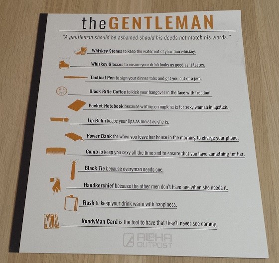
The Gentleman provides an icon-driven packing list without noting any specific brands or prices. This may suit boxes that source white-labeled products.
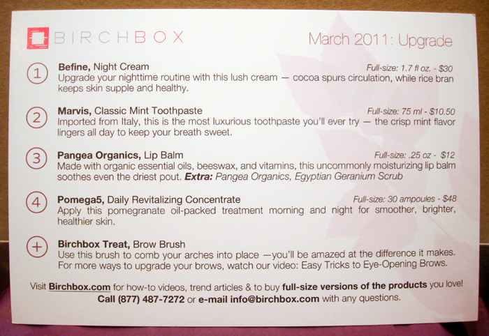
Birchbox varies their packing lists, but they are usually postcard-sized, include full-size MSRPs and offer calls to action to buy full-size items.
Another packing list from Birchbox, who uses the front for a theme and the back for the actual packing list.
Customization is Key
As you can see, there are major differences between packing lists, both across boxes and even from month to month. Consider your audience, box size, and how you can best approach providing a packing list to customers.
Questions or comments? Leave them in the comment box below!
