Sellers in the know are aware that Cratejoy is the world’s premier out-of-the-box solution for subscription box businesses, from our in-house marketing to checkout & rebilling flexibility to the Cratejoy Marketplace. But do you know exactly how special the Marketplace is?
More than three-million-views-a-month special. That’s how much.
With that many eyes, it’s crucial to do all you can to optimize your listing for conversions – i.e. subscription sales – and rise above the pack. Conversion rate is a percentage: the people who sign up to subscribe divided by those who view your Marketplace listing.
Conversion Rate = Subscribers / Listing Visitors
Your conversion rate matters for several reasons:
- It can indicate the market interest in what you have to offer,
- guide you to make changes in your marketing efforts or reaching out to customers, and
- impact Cratejoy’s onsite promotional features for sellers.
Here, we’ve gathered together some tips on what you can do today to increase your listing’s conversion rate on the Marketplace. Specifically, we’ll dive into the following techniques:
- Choosing your Marketplace categories
- Featuring strong images of your box
- Composing strong images
- Appropriate, even lighting for strong photos
- Offering a coupon code
- Ask for (and reply to!) reviews
- Setting up a YouTube video on your listing
- Providing a sneak peek of your current box
Why join the Marketplace, you say? Read why listing their businesses on the Marketplace is a no-brainer for Cratejoy merchants.
How to Find Your Conversion Rate
In the Cratejoy seller dashboard, it’s easy to monitor your conversion rate: click on the Analytics tab, then Traffic Sources. (See how in our help doc.)
You can view the individual conversion rates for your Marketplace listing and Cratejoy storefront. We recommend you check these once a week, and make changes to your listing – like the first photo in your slideshow, list of features bullet points, or coupon code – one at a time to pinpoint its effect on conversion.
Now that you know how to determine your conversion rate, let’s see how you might build it up.
Choose the Right Categories
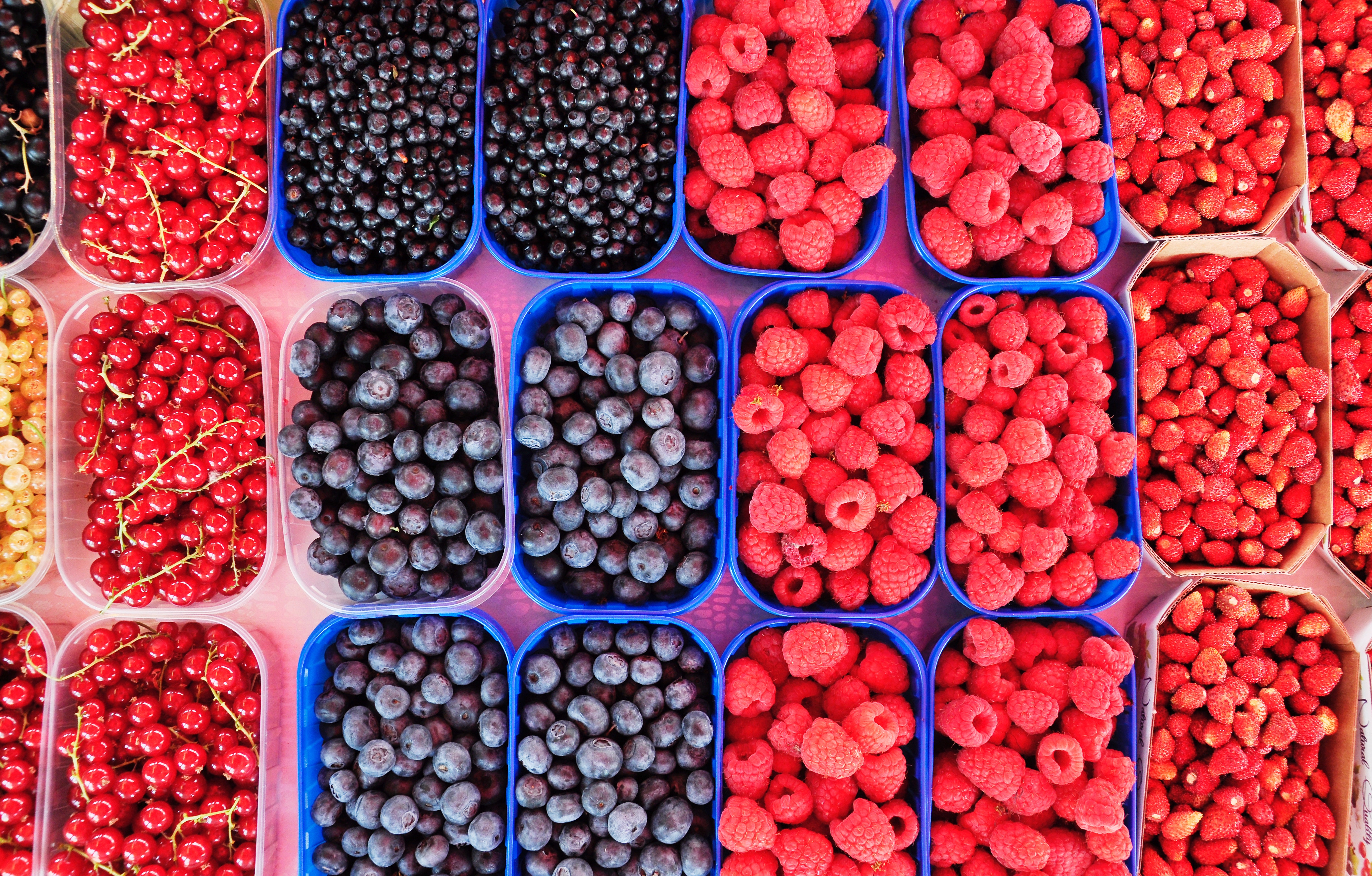
Sure, this might seem a little basic. But thinking about what Marketplace categories to sort your business into – really considering it – is important! This determines who will discover your box in search results, and that action starts your potential customer’s entire sales journey.
If you’re listing your box in a category because it’s popular or trendy, even if your box doesn’t quite fit, the potential customers searching in that niche will ignore your box. And that means fewer subscribers for your business.
Let’s say, for example, that your box is a general self-care box: big on bath and body products, healthy snacks, and home goods. But because witchy, spiritual boxes are increasingly popular, you list your box under Spiritual, New Age & Wellness.
By sorting yourself into a popular category, you might get a lot of clickthroughs, but that will actually make your conversion rate worse. Once a visitor clicks through onto your listing and sees what your box is really about, they will bail, lowering your conversion rate and losing you a sale. And because Cratejoy factors conversion rate into our marketing strategy for sellers, you won’t be promoted as much as you would be with higher conversions.
In short, you want to be accurate and honest with your category labels. The Listing page of the Cratejoy seller portal allows you to choose up to 3 categories (with attendant sub-categories); we recommend selecting only what’s relevant to your target customer, even if that means choosing only one.
Showcase High-Quality (and Hi-Res) Photos

We’ve said it before and we’ll say it again: Photos. Are. Everything.
If you don’t have eye-catching, professional-looking images of your subscription box, the value of your box won’t come across to Marketplace visitors. Moreover, if you don’t update your photo slideshow often, you won’t draw much interest when site visitors search in your niche.
Remember to Update Your Photos Every Month
Why is it so important to update your image slideshow and past boxes feature at least once a month? First, this practice ensures that you provide the best – and most accurate – expectations for potential subscribers. Second, it draws attention; for potential customers visiting the Marketplace regularly, a new featured photo could convert them to your box. Third – and most importantly – it demonstrates that you’re on top of your brand presentation, which tells your customers that you’ll be on top of business operations as well.
In short? Updating your photos leads to higher shopper engagement, clearer expectations, and a sense of trustworthiness in your brand. And that’s crucial to building a subscriber base.
Product Photo Tips & Tricks
This may sound daunting to those of you who are new to photography, early in prelaunch, or don’t yet have the budget to hire a pro. It’s scary to know that so much of your business rests on something you’re not familiar with yet. But take heed! Product photography isn’t as tricky as you might think: a professional shoot is comprehensive and will yield much more than the initial cost. The ROI on these photos will be manifold, since you can use them for social media, email, and more in addition to your Marketplace listing. Even as a newbie, it’s worth shelling out for such high-quality results.
Our recommendation: Check out our Recommended Photography Program to find an experienced product photographer and photo package exclusively for Cratejoy merchants!
That being said, there are some tried-and-true rules for subscription box photography you can implement if you aren’t up to sending your box to a professional photographer.
Stick to the Rule of Thirds
The Rule of Thirds means, essentially, that the subject of focus is located around the left or right third of the image – not the center. Why does this matter? Well, the human brain can process images in as little time as 13 milliseconds, according to a 2014 MIT study. This means that we’re all “reading” photos faster than we can actively think – and arguably, interpreting photos on the level of subconscious gut feeling.
In other words, how you lay out your photo will establish how your potential subscriber feels about it. The Rule of Thirds draws the viewer into a photo more gracefully than a centered subject, which can be interpreted by the brain as inauthentic or confrontational.

Take a look at the photo from Red Velvet NYC above. Much of the central imagery is located along the left side and top third, really engaging the viewer by drawing your eye up and across. This placement highlights first the bright red strawberries, bowls, and striped dishtowel, then the brown tones of the chocolate, cocoa powder, and eggs. Can’t you just imagine how good that chocolate cake will taste?
The Higher the Resolution, The Better
Resolution is the difference between a pixelated (“fuzzy”) photo and a sharp, clear image. For that reason, it’s one of the biggest factors – along with lighting – in what makes a picture look professional. (Don’t worry, we’ll get to lighting in a minute.)
The Cratejoy Marketplace resizes photos for Marketplace listings at 600×400 pixels and hosts images at 300ppi (pixels per inch). This means that if your picture has a lower resolution – in other words, that the image size or PPI is under that – it will look stretched-out or blurry on your listing. If the image resolution is higher – like the 1200×800 we recommend for Marketplace images – the photo will look ultra-clear.
The bad news is that, depending on your smartphone model, the resolution may be determined by your camera hardware. This means that you can only adjust it so much in your settings; after a point, it is what it is. The good news is that smartphone likely has more PPI than you need to meet our resolution minimum. Even the years-old iPhone 2G offers 1600×1200, for example, with the current iPhone X offering 12 megapixels (that’s 4032×3024, or 12 million pixels overall). And another pro tip? If you have the iPhone X, we recommend using Portrait Mode to polish up your photos.
In Android’s standardized camera app, the photo resolution is adjustable through your settings. See how to do it here.
Think Natural
You’ve likely heard that natural lighting is best for taking photos that look, well, natural – authentic, professional, and neutral in tone. Using artificial lighting like lamps or overheads, on the other hand, can cast a yellowish or bland fluorescent sheen over everything.
Whether you’re using a DSLR or a smartphone, practice taking photos at various times of day. While sunlight is always preferable to lamplight, you’ll ideally want to find a time when the sun isn’t too high in the sky, as shadows will obscure your subject. The best lighting environment you could find would be a partially overcast sky.
For that reason, we recommend earlier in the morning (before 10am) and before sunset as ideal times to take photographs. The hour before sunset is even known among photographers as the “golden hour,” when the sun is low enough in the sky to cast a golden tint on everything and optimize the attractiveness of the subject.
If you must shoot indoors or at a tricky time of day, editing your photos with image enhancement apps like Snapseed will help you adjust the image’s “color temperature” and “tint” to better emulate natural lighting.
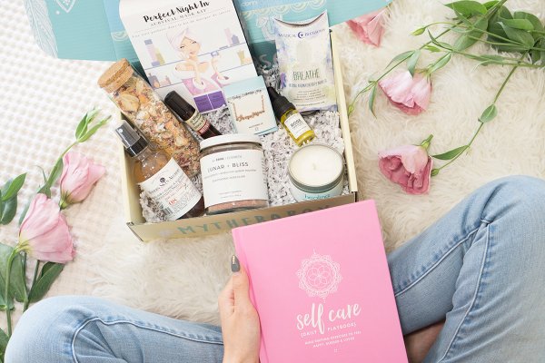
Check out the way natural sunlight highlights Therabox’s products, box, and user evenly and thoughtfully. Each item stands out, but the soft color scheme and overall brightness create an atmosphere of contentment and tranquility. In turn, this visual mood conveys Therabox’s value proposition.
Vary Your Layouts – and Show the Box in Action
Two words: lifestyle photos. These show someone using the product(s) in your box, which allows a viewer to more easily imagine experiencing the box. These images can be difficult to set up and frame, but they’re extra effective at conveying your value proposition.
See more samples: Read more about the different types of product photos and see some stellar examples in our guide to photography for the Marketplace.
Another photo layout that works well, if you’re not ready to tackle the lifestyle photo, is the flat lay. This means that you would lay out all the box contents on a flat, neutral surface and photograph them like a “collage.” Check out this example from Bokksu below.

Warm, vibrant colors like bright red and orange have been shown to increase appetite in viewers, so this color scheme is the perfect choice for Bokksu’s flat lay. Centering the red box gives the eye something to latch onto among all those differently colored snacks, candies, and other goodies. With so many product options, using a flat lay here is a smart move – it both creates abundance and provides an organizing principle for the chaos.
Test Different Platforms
In other words, compare your Marketplace photos on desktop and mobile. These different platforms don’t only offer various screen sizes, but can also differ in display qualities like color tone, brightness, or image clarity. Check out your Marketplace listing on each to make sure your photo size, image quality and appearance, and load time are consistent across devices.
Now that your product photos are on lock, let’s take a look at the other elements that make up a stellar listing on the Marketplace!
Offer Coupons
You’re a consumer as well as a business entrepreneur, so think about what would convince you to buy something. If you were tempted to buy a product, but ultimately on the fence, a discount – or the chance of free shipping – might be the factor that seals your purchase.
You can go around coupons three ways: free shipping, a small percentage off, or a low flat rate off. What you choose depends on the dollar value of your box and your projected profit margins. If you have a more expensive “luxury” box, for instance, it may be easier on you to offer a $5 discount rather than, say, 10% off the first month. (Remember that a percentage discount lower than 10% may feel “cheap” – that is, not worth it – to some potential customers.)
Note: Be careful how you set up a percentage coupon and double-check your settings. Since prepaid subscriptions usually include a slight discount from month-to-month subscriptions, you want to make sure that you don’t discount a prepaid subscription twice!
If you have the budgetary flexibility, free shipping may be your best option. Since the advent of Amazon Prime, consumers have grown accustomed to the idea of free shipping (particularly domestic). And because the goal of coupon codes are to push fence-sitters across the line to purchase, free shipping is one of those bonus perks that a customer can’t say no to.
Gather Reviews – Positive and Otherwise

Among other factors, Cratejoy considers the customer ratings and reviews on your Marketplace listing when deciding which sellers to feature in our marketing campaigns. This is because reviews demonstrate two things simultaneously! Not only do they show the quality of your product (and customer’s experience), but your commitment to customer service also.
Up your chances to be featured: Read up on the other factors Cratejoy takes into account when featuring sellers.
This second part, your commitment to customer service, is where negative reviews come in.
For Negative Reviews, Be Mature and Graceful
When someone badmouths your box online, it might be tempting to refute each and every one of their points. But let’s face it: you’re not Alexander Hamilton and the reviews section is not the place for a screed.
Try to take the perspective of your disappointed customer. After all, they were emotionally invested enough in your box to subscribe! How might you use this as an opportunity to show you care – and (hopefully) retain the customer?
Did you know? The most common reason for a negative review – and ultimately, churn – is too long of a wait for the customer’s first box. Look into moving to an ongoing & bulk shipping schedule so that new subscribers don’t have to wait! Read how to set it up.
Let’s say, for example, that the customer feels disappointed that your box arrived with a broken item (say, a mug). You know that the item must have broken during the fulfillment & shipping process, perhaps because it wasn’t wrapped delicately enough. You can respond in a couple different ways:
- Too bad the mug broke in shipping. We wrapped it really good so it must be the post office – you know how they are. I’ll ask them to be more careful.
- I’m sorry to hear that the mug included in this month’s box arrived broken. We would be happy to send you a [replacement item or new box] free of charge. Please email help@boxname.com with more information and we’ll send it out right away.
Which response would you prefer if you were a customer? Yeah, exactly: the second. If it’s possible to go a step above and beyond for your customer, do so, especially if you’re brand-new. By sending them a free replacement for the item – or a free box if you’re able – and allowing them to keep the original, you show that you truly care about their experience. Moreover, you show other potential subscribers reading your listing reviews that you care. That’s a convincing way to earn their trust… and raise your listing’s conversion rate.
For Positive Reviews, Be Friendly and Grateful
When a customer takes the time to write a happy review of their experience with you, thank them! Thoughtfully (and briefly) replying to positive reviews will show new site visitors how you appreciate your customers.
Choose positive reviews that discuss specific details the customer liked about your product selection, shipping/delivery, or something else. Thank them for their support, then comment on the specific detail they mentioned. This shows you’re actively engaging with their ideas, rather than posting a generic reply to everyone.
Add a YouTube Video to Your Listing

Did you know that hosting a product video can boost an ecommerce store’s conversion rate by up to 9%? Well, now that you do, there’s no reason not to include a video on your Marketplace listing. As a subscription box business, we recommend posting a recent unboxing and/or tutorial video on your listing, depending on whether your value proposition is product- or experience-based. Once some months pass and you have a steady subscriber base, you might also put out a call for video testimonials.
Learn more: See how simple it is to add a YouTube video to your listing with our help doc.
For an unboxing, ask an influencer if they would like to receive a free box in exchange for an honest review. (The key word here is honest: they need to be free to disagree with your procurement and curation choices.)
You can also shoot an unboxing video yourself – plenty of Cratejoy merchants have done this and succeeded – but if possible, try the influencer route first. Studies show that even micro-influencers (those with 500-100,000 followers) have a big impact on consumer behavior, and they’re more accessible to work with for small businesses. Specifically, a study by Experticity found that 82% of consumers would be influenced to purchase something based on a micro-influencer’s opinion. Why? Because micro-influencers seem like “real people” – they’re authentic and lack the massive fan community that can make some bigger influencers appear out-of-touch.
In short, it’s easier to trust someone’s opinion if you already relate to that person.
Examples of Strong Unboxing Videos
We’ve collected here a few of the many unboxing videos included on merchants’ Marketplace listings. This kind of video might seem straightforward, but there are a myriad of ways to approach unboxing. Check it out:
https://www.youtube.com/watch?time_continue=4&v=6e0-VVPJhXs
This is a good example of a standard unboxing video. With 40,000+ followers, Alana – an Accio! affiliate – is popular within the fandom YouTube community, and she produces unboxing videos regularly. She’s even unboxed Accio! before, and calls it her “favorite Harry Potter subscription box ever.”
As you can see, Alana explains and comments excitedly on each item as she takes it out of the box, making sure to feature the product prominently in front of the camera. You can tell she’s super knowledgeable about the Harry Potter series, so you trust her opinion. She also includes an affiliate plug for new subscriber discounts at the end.
The Pink Envelope’s unboxing video of Saloon Box, a DIY cocktail subscription, works because Samantha doesn’t stop at the unboxing itself. She takes the extra step of demonstrating Saloon Box’s unique experience by creating the drink featured in that month’s box! Additionally, the unusual way she positions the box facing the camera allows you to experience the box vicariously. You get the full subscription experience through Samantha reading aloud the instructions, mixing ingredients, and taste-testing the featured cocktail.
Our last example, from hip fashion/lifestyle subscription Quirky Crate, is entirely wordless. (What a twist!) It’s not even so much a “video” as a slideshow of still images set to an energetic electronic backbeat. But it works so well! Each product is shown clearly and prominently, while the bright color scheme paired with upbeat music works to create feelings of fun and optimism.
Display Recent Boxes – and a Preview of Your Current Box

Recently, Cratejoy launched the opportunity to feature images of past and current boxes on your Marketplace listing. We’ve found that doing this allows potential subscribers to get a much stronger sense of your box’s niche and value. That way, customers on the fence can feel more secure, when making their decision, that your box is the right fit!
Showing a sneak peek of your “Current Box” – the box you’re currently taking orders for – does two things to persuade the customer. First, it provides a clear, appealing image (and description) of this month’s delivery, allowing potential customers to better understand what they can expect from their experience. Second, it reminds your potential customers of your current order-by date, creating a sense of urgency around your box. And urgency, along with strong photos, can help drive purchases.
Featuring a sneak peek of your current box, as well as adding your three last months of boxes, is the most straightforward way for customers to understand what your box is all about. However, remember that customers can’t buy any of the past boxes on your listing; it’s just for persuasion purposes. As a potential customer sees the appeal and personal fit of your subscription, they may feel eager not to miss out on the next awesome month of your box – and that will push them off the fence.
All in All…
Your store listing on the Cratejoy Marketplace is the easiest way to expose your brand to millions of people. However, none of that matters if you don’t net conversions. Follow the tips we’ve outlined here and watch your listing conversion rate skyrocket! And if you have questions, you can always find our support request form here.
