So you’ve got a great concept for a subscription box business, but aren’t sure how to get the word out. Well, the first thing you can do is set up some kind of presence online. Creating a landing page for your eventual website works wonders to get your name out there, validate your idea, and begin building a base of leads.
In this blog post, we’ll delve into the different options you have for building a prelaunch page, design tips, and the goals you should keep in mind as you create it.
Picking a Platform
You have a number of options available in terms of web hosting. Below, we’ll break down the most popular platforms for ecommerce landing pages and discuss the benefits and drawbacks of each.
Cratejoy
As you know, Cratejoy is the internet’s premier all-in-one solution for subscription box businesses. For $39/mo, you’ll receive a full website (with prelaunch-specific theme) in addition to a listing on the Cratejoy Marketplace, backend technical support, analytics, the ability to connect your custom domain, and tons of app integrations. If you use MailChimp for email marketing, you’re all set here; Cratejoy integrates with the popular app easily to capture email lead. Furthermore, Cratejoy saves all past versions of your site so you can easily undo (or redo) changes.
Here’s an example we’ve created with the Cratejoy Designer. It has a straightforward layout, beautiful central image that shows off the product, catchy tagline, concise copy, and clear CTA. We’ve also included user-friendly social media buttons to capture leads on multiple platforms.
Carrd
This web builder provides dozens of mobile-responsive templates. To access email marketing integrations, contact and signup forms, the ability to connect to your custom domain, and widgets for apps like Google Analytics, you’ll need to upgrade to a Pro plan ($19/year).
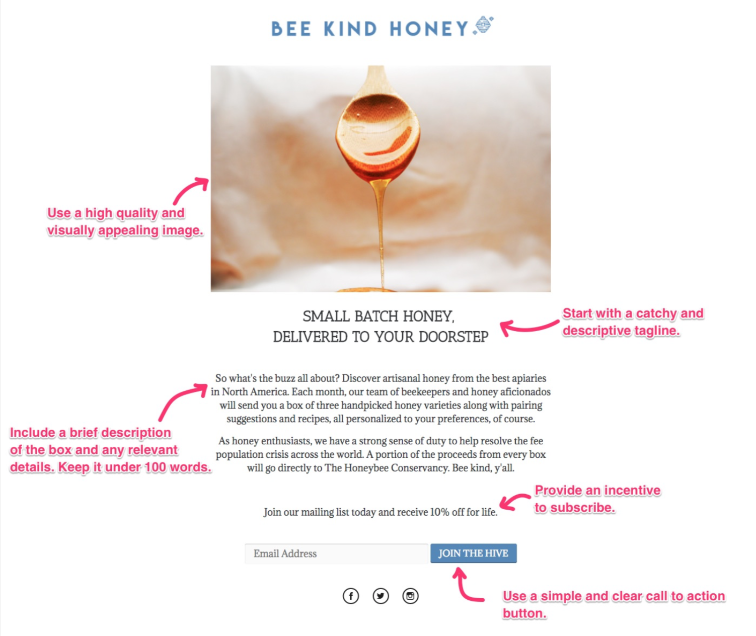
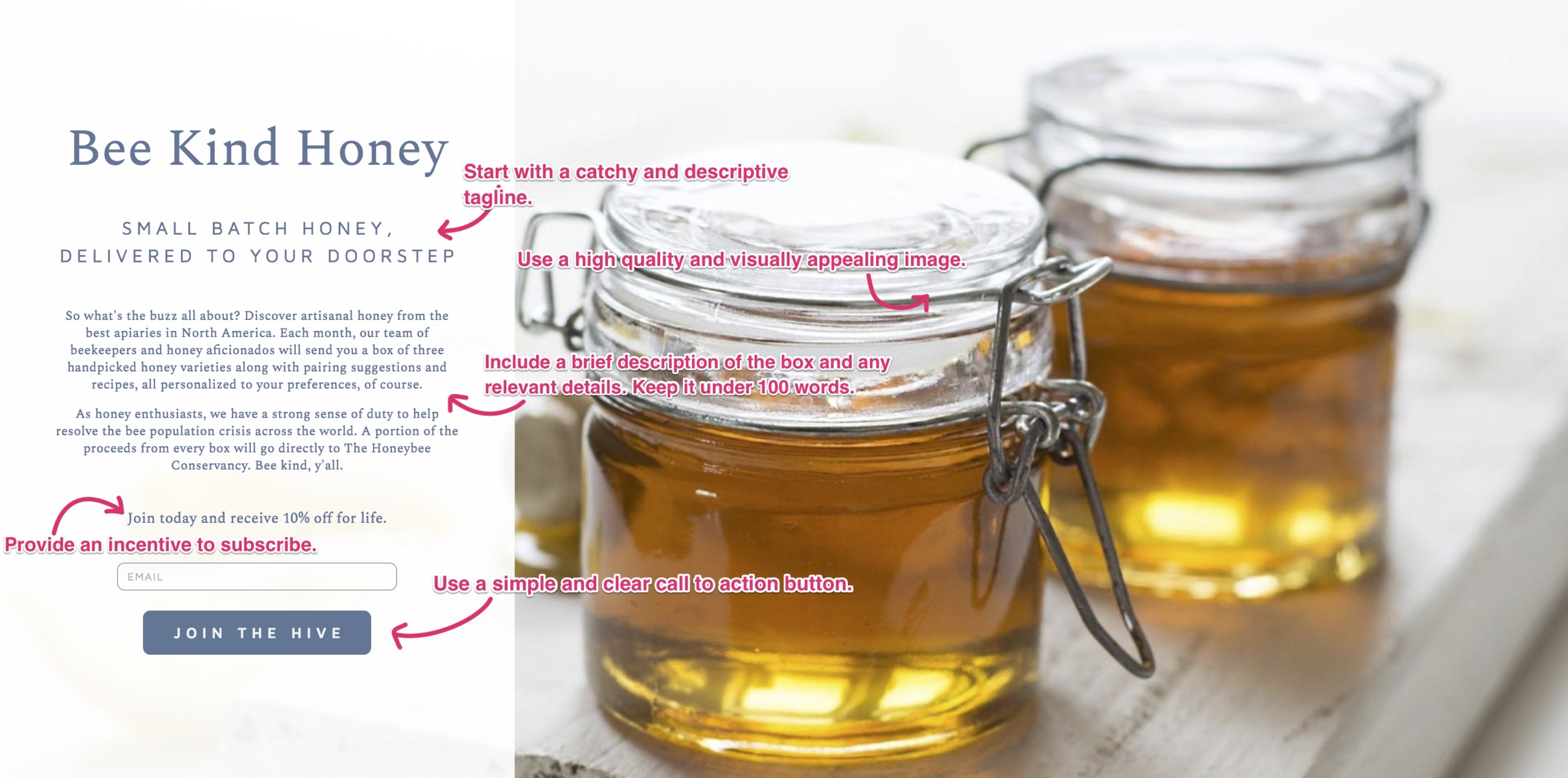
Here’s an example landing page we created with Carrd. As you can see, it uses a left-to-right layout with a centrally located, eye-catching image, brief text copy, and an intriguing tagline to draw in customers. Bee Kind seals the deal with a prominent CTA button and incentive for joining.
Kickoff Labs
Kickoff focuses on viral marketing contests to convert site visitors to leads. These methods can include leaderboard giveaways, referral rewards, a prelaunch waitlist, opt-in bribes, or a coupon giveaway. They also offer A/B testing, analytics, and fraud protection. Kickoff Labs offers a free plan, but to remove their branding, plans begin at $75/month.
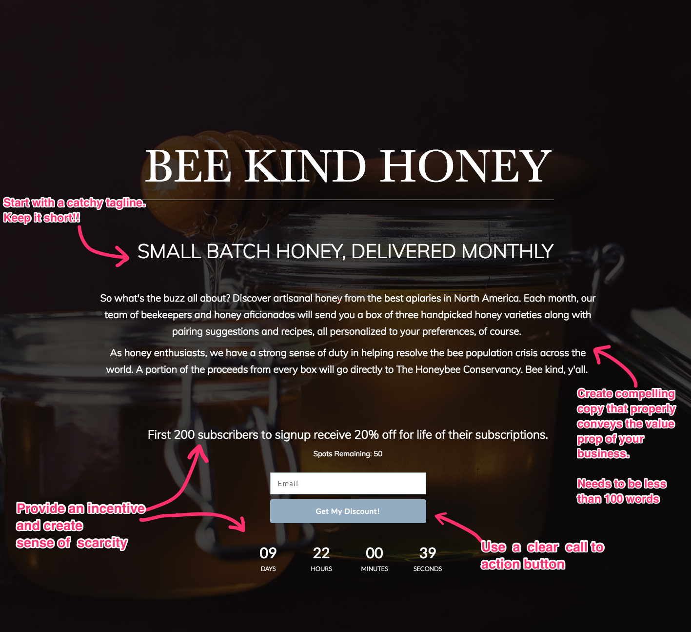
Here’s an example for Bee Kind that we produced through Kickoff Labs. The color scheme is clearly different – this evokes a naturalism that the other, with its clean, bright lines, doesn’t. However, it utilizes the same design elements (CTA, incentive, large central image, tagline and descriptive copy) to encourage signup capture. This template adds a countdown clock to emphasize scarcity.
Designing Your Template
When you have a world of possibilities for customization, it can be hard to decide exactly how you want to adapt your page template. How can you demonstrate your value proposition in concise, engaging language? What emotions do you want to evoke in your subscribers when they open their first box?
We recommend you incorporate colors associated with those feelings into your branding. If you want to infuse customers with energy and excitement, warm hues like red, yellow, and orange are the way to go. If you want customers to feel pampered or relaxed, calming colors like blue, green, or gold may be best.
The Purpose of Your Page
Your landing page doesn’t need to be complicated – in fact, it shouldn’t be. Your goal in creating this page is to make a place where potential customers can learn about your subscription and sign up for your email list. In other words, you want to build a base of leads to convert into subscribers.
Keep the following principles in mind and you’ll create a page with purpose.
Value Proposition
Why should potential customers be interested in your subscription box? It’s crucial that you convey the unique value proposition you offer. This is separate from the overall value of your box, as it’s the reason a customer might sign up. Some examples of a value proposition might be to have new experiences, to learn new concepts, to try samples before you buy, a guaranteed monetary value (like “$150+ worth of goods in every box!”), or making a difference in the world.
Incentive
Why should visitors on your prelaunch page give you their email address? Offering a special or unique benefit is a great way to encourage people to give you their email addresses. We recommend offering free shipping or a nice discount on their first box. If you go with the latter, try offering them a flat rate off instead of a percentage, like “Get $10 off your first box.” This can often make the incentive feel more valuable to visitors and prevents them from having to calculate a discount in their heads.
Scarcity and Cut-off Window
Scarcity works hand in hand with a cut-off window. It’s the rule of supply and demand: things that come scarce are more valuable than things in abundance. An example of creating scarcity on your prelaunch page would be making a limited number of sign-ups (like the first 25) eligible to receive certain benefits or a strict deadline to order by. After all, people procrastinate. Give customers a reason to act now, rather than thinking they’ll do it later.
Call to Action (CTA)
This is the most important element of your landing page – a button or phrase that persuades the customer to proceed. It’s best to do something short and sweet here, like “Sign Up Now” or “Keep Me Posted.”
Try to include one CTA on your page, front and center, for email capture. This avoids overcomplicating your messaging. Each CTA button needs to be clear, simple, and prominent to attract subscribers. Consider your color scheme and placement when developing your CTA buttons.
Want more tips?
Check out Cratejoy’s design advice for building attractive webpages and taking product photos for your marketplace listing, then read our full guide on setting up a prelaunch.
