What’s the difference between a good listing page and a great one? Sure, stellar photos are important (we’ll cover that, don’t worry), but there are several tiny changes you can make to truly optimize your listing page. These tricks and tips will make it easier for shoppers to find your box, learn about your product, and feel confident pressing that subscribe button.
So – whether you’re looking to improve your current listing, do a complete overhaul, or are setting up for the first time, we’ve gotchya covered.
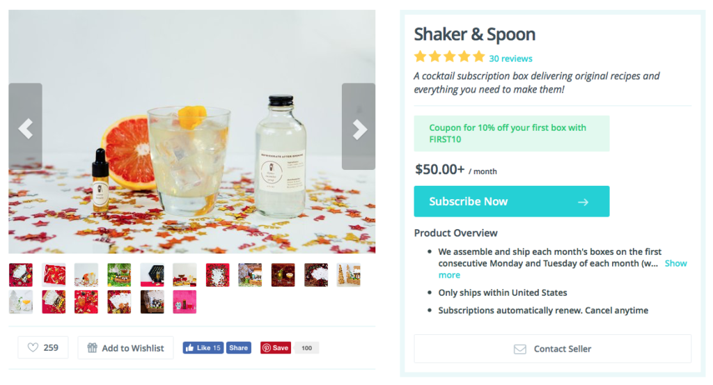
1. Invest in product photography
Good product photography is a critical key to success in any marketplace. People are visual creatures, and photos can singlehandedly build or destroy confidence in our buying decisions.
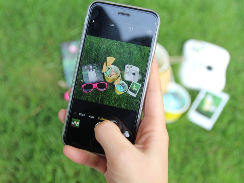
Luckily, quality photos don’t have to be out of reach. Sellers don’t need a photographer, light kit, or DSLR to come up with great shots – a smartphone, natural lighting, and attention to composition will put you on the path to solid product photography.
Need some help? Here are some of our tips for taking a great photo.
…and show multiple boxes
Think about your own buying behavior as a shopper. When you’re considering investing in a new product (especially one that will bill on a recurring basis), it’s helpful to have as much information as possible to make that leap of faith.
This kind of confidence comes from quality and variety. Rather than 10 images of the same box, consider showing 2-3 photos of several months’ worth of your product.
Sellers may not be able to offer this level of variety right off the bat, but it’s certainly a goal worth working toward.
2. Get reviews
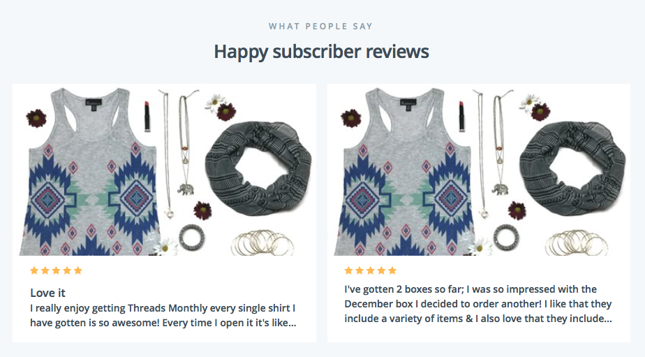
Good photos may pique a customer’s interest, but reviews can be the deciding factor between hitting the subscribe button or running for the hills.
And it’s not just bad reviews that can turn a customer away, no – the absence of any reviews at all is what kills the customer experience. Again, consider your own shopping habits – are you more likely to trust a 4-5 star product that’s been rated by dozens of individuals, or a nice (but unrated) subscription that shows no sign of consumer satisfaction?
For business owners who are skeptical to ask for reviews for fear of receiving negative feedback, there are two things to keep in mind.
First, accepting criticism is an important part of growing as a business owner and will ultimately help you improve your product. Second, negative reviews add a level of authenticity to your listing page. In fact, a recent study by Northwestern University revealed that bad reviews actually help increase sales – because it assures shoppers that real people are writing their real experiences about a product, rather than bots or spammers.
3. Correctly categorize your box

It may seem like a good idea to group your box under seemingly more “popular” categories, but savvy business owners will resist such urges.
Here’s why. Say a shopper who fits your ideal customer profile is browsing through Cratejoy categories, but in perusing their interests, they never see your box. You don’t want to miss out on potential customers by mislabeling your products.

Luckily, Cratejoy allows sellers to pick a primary category and two subcategories to represent their subscription. It’s of the utmost importance you select ones that represent your box and the products inside, so the people who want to find boxes like yours can do so.
If you need to update your category and subcategories, you can do so in your Marketplace portal.
4. Sharpen your copy

There are 4 copy components to Cratejoy’s listing pages: the brief description, main headline, detailed description, and list of features.
Sellers will benefit from developing snappy, thoughtful copy in each of these categories to give subscribers an understanding of their box’s theme, vision, and products.
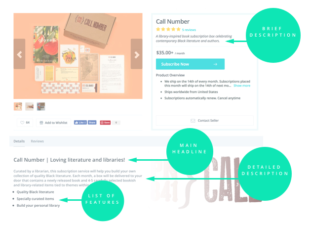
The Brief Description
This should be your elevator pitch. If you only had five seconds to describe your box to a potential subscriber, THIS is what you would say.
Good brief description examples:
- Muse Monthly: A Subscription Box for Lovers of Books & Tea
- Retro Game Treasure: Vintage Video Game Subscription
- Barbella Box: The Perfect Complement to your CrossFit Lifestyle
- SumoJerky: Craft beef jerky delivered to your mailbox
Main Headline
This is a headline for your product description; it should encapsulate the theme of your box and the items inside.
Good main headline examples:
- Pearlesque Box: Discover Non-Toxic, Organic and Natural Skincare
- Shaker & Spoon:Make great drinks. Don’t worry, we’ll teach you
- Hunt a Killer: We deliver serial killer tales to your doorstep
- Salty Bath: Rub-A-Dub Dub: Turn Your Tub Into A Spa
Detailed Description
This section is a short paragraph that allows sellers to expand on their box offerings and what subscribers can expect to receive every month. If your box donates to charity or supports any causes, this is a good place to include that information as well.
Good detailed description example:
Get Wagging: Every month, Get Wagging delivers a fun and seasonal collar for you and your dog to enjoy. When your next collar arrives, we also include prepaid return packaging so that you can give back to an animal in need by donating your Get Wagging collar from the previous month. Your gently-used collar is then reused by a dog who needs one.
List of Features
This bullet list of features is an eye-catching way to make sure subscribers know exactly what they’re getting with your box. Total retail value, number of products, shipping, and other informative details are great for this space.
Good list of features description:
Tamed Wild Apothecary:
- Shipping included in monthly cost!
- Full-size products, not a sample box!
- Box retail value is always $70+
- Teas, Tinctures, Tonics, Crystals, Incense & Other Eclectic Items!
5. Add an expected ship date
The most common question sellers field is Where is my box? To eliminate that customer uncertainty, Cratejoy allows sellers to add their expected ship date to listing pages.
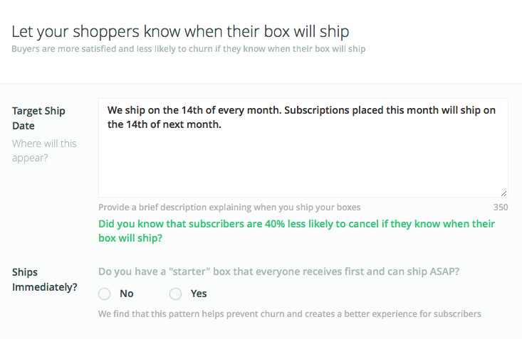
This correctly sets subscriber expectations while eliminating customer support correspondence on the seller’s end. Just like categories and listing page copy, this information can be updated in your Marketplace portal.
6. Add a YouTube video to your listing
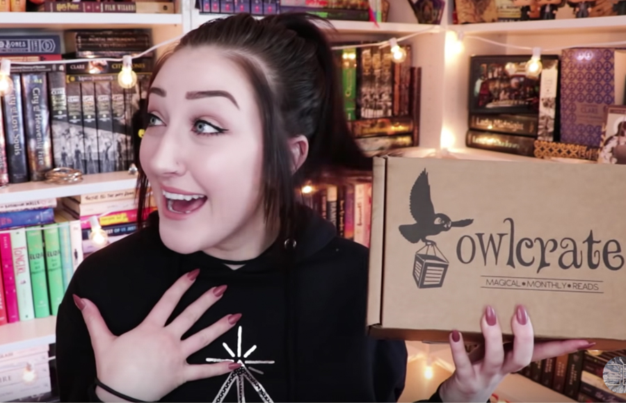
According to Kissmetrics, consumers are “64-85% more likely to buy after watching a product video.” In the world of subscription box marketing, that could look like an influencer review, subscriber testimonial, or simple unboxing footage. Remember, video is similar to photography in that quality is key. If you find an unboxing video of your product on YouTube, but the reviewer doesn’t represent your brand, your customer, or the quality of content you want to be associated with, don’t use it.
Furthermore, if you do end up using an influencer video on your Marketplace listing, make sure to ask permission before doing so. Unless the video was created through a mutual partnership between you and the creator, steer clear of using other people’s content to sell your subscription box.
Read more: For instructions on adding a YouTube video to your listing, check out our help doc.
Need more help?
Check out our private Facebook group for Subscription School and the Cratejoy seller blog for more information on how to improve your marketplace listing and optimize your product pages for success.
