Good website design can make or break your subscription company’s success. The goal of an e-commerce landing page is simple: attract customers, provide product insight and create a user-experience that convinces users to spend time and money. Having a well-designed theme or layout optimized for conversions can help you acquire new customers and increase revenues. Here are three tips for designing an attractive subscription e-commerce site.
Don’t Underestimate the Power of Visuals
The eye and the mind perceive all images, fonts and colors very differently. A large, high-resolution photograph prominently displayed on your landing page will leave a stronger impact than a smaller, lower-quality image placed on a moving image carousel. If you or your team members are not experienced photographers, invest in a product photographer with a solid portfolio. If you are early in the game and can’t afford a professional, check out these 40 DIY tips and resources.
Another design aspect that customers subconsciously notice when shopping online are fonts and color. People are trusting you with their money, and the combinations of fonts and colors you use affects your overall branding and whether or not people feel like they’re being scammed. Getting creative with your font combinations is a great way to add credibility, visual hierarchy and brand personality– just be sure to keep your limit at around 2-3 fonts. Choosing fonts which include a variety of different weights is always a plus. If you need help, try searching for inspiration or looking up some awesome web font combinations.
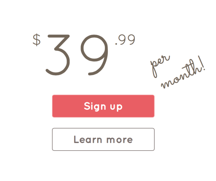
Remember: while fonts can be fun, it’s also important to maintain legibility. A decorative display font can serve it’s purpose as both a headline, or a fun subhead. Everything else should be in a more legible font, for ease of readability. Our seller 21bundles did a great job of choosing a font that represents the personality of their brand and using color to highlight their sales pitch.
Your Customers are on the Move- Your Website Should Meet Them
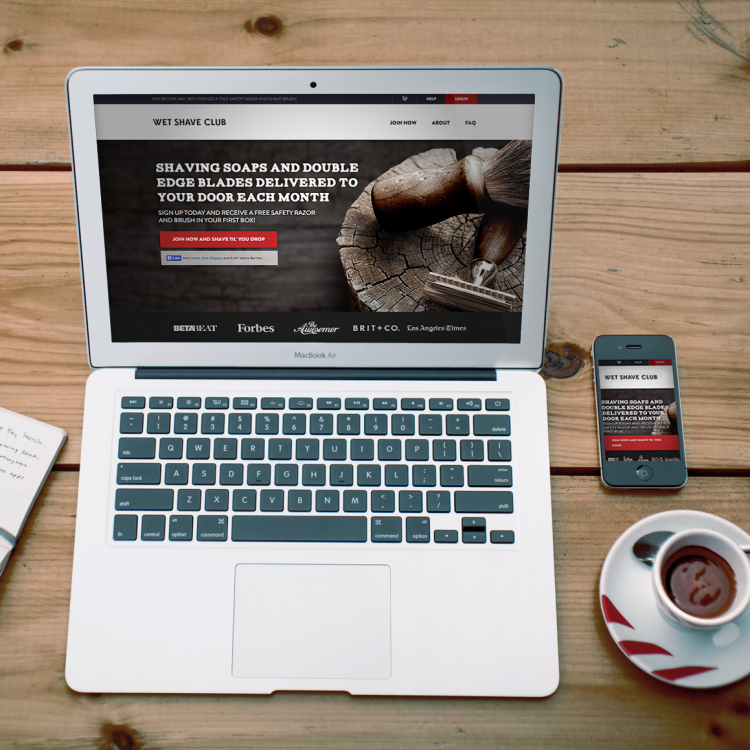
72% of American adults have a smartphone. Don’t believe the hype about responsive mobile design? You better shift your thinking. According to a 2013 study by Spyder, 67% of shoppers or more likely to buy from a mobile-friendly site. Last year over $38.3 billion worth of purchases were made on either a mobile or tablet device. These numbers are expected to triple over the next few years and simply cannot be ignored.
Mobile transactions bridge online and physical shopping and completely change how buyers interact and consume products. The journey on your page should be consistent whether it is being viewed on a desktop, tablet or smartphone. Here’s a list of helpful mobile commerce design tips.
Keep It Clean, Make It Flow
While it’s tempting to fill your website with as much information, imagery, and colorful excitement as possible- you should refrain from going overboard. Start simple with your logo, color palette, main photography/imagery and plenty of “white space” (this magical space is what allows things to stand out on your site! And prior to popular believe, it doesn’t always have to be colored white).
Clean and minimal web design is not only in style, but also helps to gain credibility among your visitors. It shows that you have nothing to hide, promotes usability, readability, and also boosts the prominence of the information you are trying to convey. Through this, you will gain a certain flow to your website that would have been otherwise lost in the shuffle. Take a look at some of this awesome landing page inspiration and notice how the spacing helps your eye travels through each design.
We’re here to help!
This week at Cratejoy we launched “Design Versioning”–a new feature that will help you track and test changes you make on your subscription business’ website in order to create a highly optimized design that converts into higher revenue and success.
Once you make a design edit you can go to your seller portal and view your design history. Your most recent edits are unseen by the customer until you click “Release.” This allows you to take your time and edit your site without temporarily taking it down or disrupting a current user’s experience.
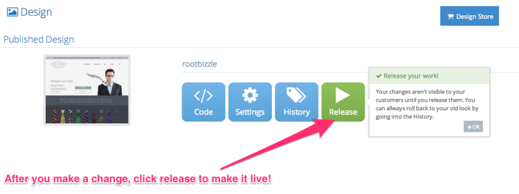
Once you’ve settled on your changes and made them live, your customers are able to view them. If you change your mind or notice that your conversions have dropped, you can use the roll back feature to revert to a previous version of your design.

For an in-depth explanation on how to use design-versioning, check out our support guide.
