For some, marketing their subscription box is the hardest part of running a business.
To start with, many of us struggle with talking ourselves up! Maybe for you, that struggle extends to talking up your business. Or maybe you’re great at “selling” your subscription box idea, but you have a hard time with the practical details of marketing – putting your business out there on social media, drafting strong promotional emails, or connecting with leads in the real world. Well, this article is for you.
Whether you’re working with Facebook Ads or engaging with customers on your store’s Facebook Page, this social media giant is an important tool in your arsenal. Posting on your Page counts as organic (i.e., free) marketing, while you’ll need to pay for Facebook Ads. However, both methods are certainly worth your time.
Posting to Your Facebook Page
First, make sure your company has a Page, not a profile. Facebook requires users posting on behalf of a business to set up a Facebook Page for the company; Facebook user profiles are restricted to individual personal use. What’s the difference, you ask? The appearance, for one, as well as technical ability to sell to consumers. For example, take a look at Cratejoy’s own Page:
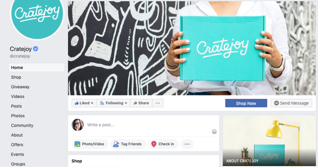
See how the options on the left sidebar menu are geared towards sales and building a customer community? That’s not going to be available if you try to make a personal profile for your business.
How (and How Often) to Post
The most important thing to keep in mind when marketing your subscription box on social media is that you need a strategy. Here are some tips:
- Consider your target audience. In terms of demographics and psychographics, who uses Facebook over other platforms? Remember your target customer. Do they primarily use Facebook (as opposed to Instagram, Pinterest, YouTube, or Twitter)? If not, would their loved ones use Facebook? The answer to these will determine your audience — and your purpose, as you can gear your Facebook posts to promote subscriptions or gift sales.
- Use Canva to make eye-catching graphics. The Facebook News Feed is an ideal platform for visual ads. Design sites like Canva make it easy (and inexpensive) for business owners without design experience to build strong graphics, which you’ll need to grab scrollers’ attention.
- Shoot video posts. This format will autoplay in the News Feed, which means an increased rate of impressions. However, most users view Facebook videos without sound, so make your message understandable visually. (Be sure to check out Facebook’s spec requirements first!)
Impressions vs. reach: what’s the difference? Essentially, an impression is each time your ad is displayed on social media, while reach is the number of users exposed to your ad. So if a subscriber shares your ad, for example, and as a result user is exposed to the ad twice, that’s two impressions.
Setting Up Facebook Ads
The prospect of setting up a Facebook Ad can feel daunting. It’s a complex process that requires a lot of thought! But with a little planning, you can reap the rewards.
First, decide what your budget is. Facebook offers two options for ads — a “Daily Budget” and a “Lifetime Budget” — so it’s important to know how much you can afford. If you’re bootstrapping and simply running a basic test, it may be smarter to select a Lifetime Budget and a limited timeframe (like 4 days over the week or a 3-day weekend), as Facebook will automatically run the ad to maximize your exposure and reach within those parameters. If you have more wiggle room in your advertising budget, set a Daily Budget and see how that impacts your results.
Based on your needs and budget, decide your objective. Facebook Ads are set up to revolve around certain objectives, like Traffic (the number of people who navigate to your site or listing via the ad), Reach (people exposed to your ad), Lead Generation (email signups), Engagement (page likes, comments, and follows), and more.
Pro tip: The advice we gave earlier about multimedia — using images and especially video to drive interest — applies to Facebook Ads as well. Keep in mind that Facebook owns Instagram, so you can set up your ad to show up on both social media platforms! Make sure any Facebook Ad you create is visually Insta-worthy.
Additional Tips for Facebook Ads
- Take advantage of Facebook Analytics. Evaluate your ads habitually and revise your approach as needed. The Facebook Ads Manager offers three ways to measure the success of an ad: through customer engagement, the brand objectives you’ve set up, and sales/conversions.
- To start, consider focusing on click-through rate (CTR) over full conversions. Because Facebook is a platform for making personal connections, center your efforts on making a connection with your audience. Focusing on CTR to start will help you identify what’s working — and what isn’t — to get customers to your listing in the first place, where you can sell to them.
- Make sure to offer a clear value proposition and incentive in your ad! Including a unique value proposition and incentive allows you to get leads onto your listing – where they’ll be able to learn more about what you’re offering, then buy.
- Retarget your audiences. Don’t be afraid to target an audience more than once. Doing so keeps your brand at the top of users’ minds and lets you tweak your approach.
- Use lookalike audiences. Choose a group of your best customers and Facebook will identify the commonalities between the group members. From there, you can create similar audiences for your ads – which multiplies your reach.
Examples of Strong Facebook Ads
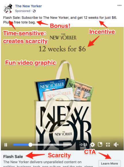
This ad has a ton of design elements persuading leads to click through. The caption allows the New Yorker to double down on its incentive (12 weeks for $6), value proposition (what a bargain!), and bonus offer (which adds to the bargain). The featured video shows issues sliding out of the tote bag, which demonstrates the incentive and bonus. Lastly, the phrase “Flash Sale” above and below drives home the time-sensitivity of the offer, which creates a sense of scarcity – and encourages the user to click on the CTA.
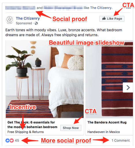
In this ad from The Citizenry, a home decor and furniture store, the slideshow works to showcase The Citizenry’s versatility, letting you imagine these items in every room of your home. Each caption highlights the incentive (free shipping/returns) or a detail that makes the product unique and high quality (“Handwoven in Mexico”). Perhaps the biggest draw, though, is the social proof above and below the ad: 45 people have liked the ad, including at least 2 personal friends of the user. It may as well be a real-life recommendation.
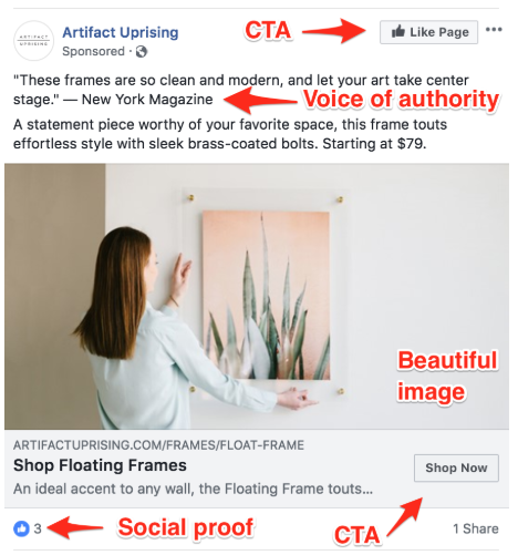
This Artifact Uprising ad does a good job with its photography: it adheres to the Rule of Thirds and looks clean and breathable. The quote from New York Magazine underlines the way the woman’s art print “takes center stage” in the photo. There are also two CTAs – one for brand awareness, the other for click-throughs – to optimize the ad’s success, and social proof in the 3 likes at bottom.
Want more tips? Familiarize yourself with the practical concepts behind Facebook marketing with Cratejoy’s customer acquisition case study and best practices on managing your Facebook page to maximize your promotions.
