Consumers judge products based on what they perceive their value to be. That’s why the look and feel of a product are so important.
For subscription boxes sold online, photos are the closest the consumer gets to picking up the product. How your subscription box is seen by a subscriber factors into how much value they think they’ll get out of your box, how much they’re willing to pay, and ultimately their bottom-line decision: Should I subscribe?
Below, we’ll explain:
- How many photos you should have on your listing
- The relationship between product photos and emotions and how it can help you boost sales
- How to use color in your product photos to stand out in an ecommerce marketplace
Marketplace Listings Perform Better with 8-10 Images
Here at Cratejoy, we’re constantly looking for ways to make the Marketplace better. We researched the optimal number of photos for our listings.
From our tests, we found that customers didn’t look at all the images when a listing had more than 10. On the other hand, with less than 4 images, customers had trouble building trust and felt they didn’t have enough information to justify making a decision to subscribe. Most importantly, we saw the highest conversion rates (sales volume) when a listing had 8-10 images.
Key Takeaways:
- 8-10 high-quality, high-resolution images are ideal
- More than 10 images is too much information for customers and they often don’t look at every image
- Less than 4 images and customers aren’t able to build trust
- Subscription commerce needs more photos because, as a seller, you are trying to build an ongoing relationship with your subscribers
Photographs & Emotion: How Are They Related?
Your photos are the first thing a potential customer sees when they are exposed to your box. Research from Wyzowl shows that visuals are processed approximately 60,000 times faster than text.
People tend to remember only 10% of what they hear [and] 20% of what they read, but a whopping 80% of what they see. Making sure your photographs are an accurate reflection of the message you are trying to send is imperative to a successful online listing.
A study by Scott Rick and George Lowenstein, two behavioral researchers at Carnegie Mellon University, find that expected emotions play a large role in purchasing decisions. In other words, how a customer thinks they’ll feel after buying something is weighed against how they’ll feel about not buying.
For your Marketplace listing, this means you can tailor your photographs to depict a certain emotion. Showing someone interacting with the box in a positive way or even choosing a bright, well-lit background could help shape how the customer feels about your product and can encourage them to subscribe.
“Visitors are more likely to add a product to their cart when the emotional process takes control, as they are directed by ‘how it feels’ and not ‘is it worth it?’” says Dr. Liraz Margalit, a Customer Experience Psychologist at ClickTale.
Think about the image above. Not only do you see a cute dog, but you see how the product, Dapper Dog Box, is supposed to be used. Seeing a cute, happy dog ignites an emotion in you, which is a result of looking at the product. This aligns the positive emotion you felt with your perception of the product. This single picture can communicate that this box can make your dog happy and, by buying it, make you feel happy.
But you don’t need an animal or a person to ignite emotion through your product photos. Look at the following image from Shaker & Spoon, a box that delivers recipes and ingredients for cocktails:
This image beautifully utilizes color to portray a feeling. You have the seasonal reds, greens, and whites that make you think of the holiday season in addition to the warm, cheerful aura that surrounds it. But you also see the cranberries and cinnamon sticks which convey flavor. Together, this picture communicates the kind of taste you can get from ordering one of their boxes and evokes a feeling rather than a subconscious cost-benefit calculation.
Key Takeaways:
- Using people or pets to directly convey positive emotions can help the customer connect your brand/product with those positive emotions
- Customers are driven by their emotions to make purchases. If you help a customer feel something good about your product, they will be more likely to subscribe
- You don’t have to explicitly display emotions. You can depict a certain scene to imply the emotion (e.g. holiday arrangement = warmth, family, giving, etc.)
Attracting Customers to your Marketplace Listing: Visual Processing
Depending on the collection of items, our brains process things in two distinct manners: serial and parallel. Serial processing is when you need to examine each individual item in a set, like when you read this sentence. You read word by word, not the entire article at once. However, for certain tasks, our brain does process everything all at once. If I asked you to determine which of the words in this paragraph was bolded, you would be able to point it out instantly without the need to check each individual word. In fact, you were probably eyeing it as you read through. This is called parallel processing. But what does this mean for your Marketplace listing?
One of the things that our brain processes in parallel – which you can utilize in your Marketplace listing – is color.
Having colors that make your box pop or stand out in some way can do a lot to get your box noticed. This doesn’t mean that you should tint all your pictures with an atrocious yellow hue, but it means you can choose your backgrounds carefully and focus your image around particularly colorful items. Your images should display a balance between something that catches the eye and something that’s pleasing to look at.
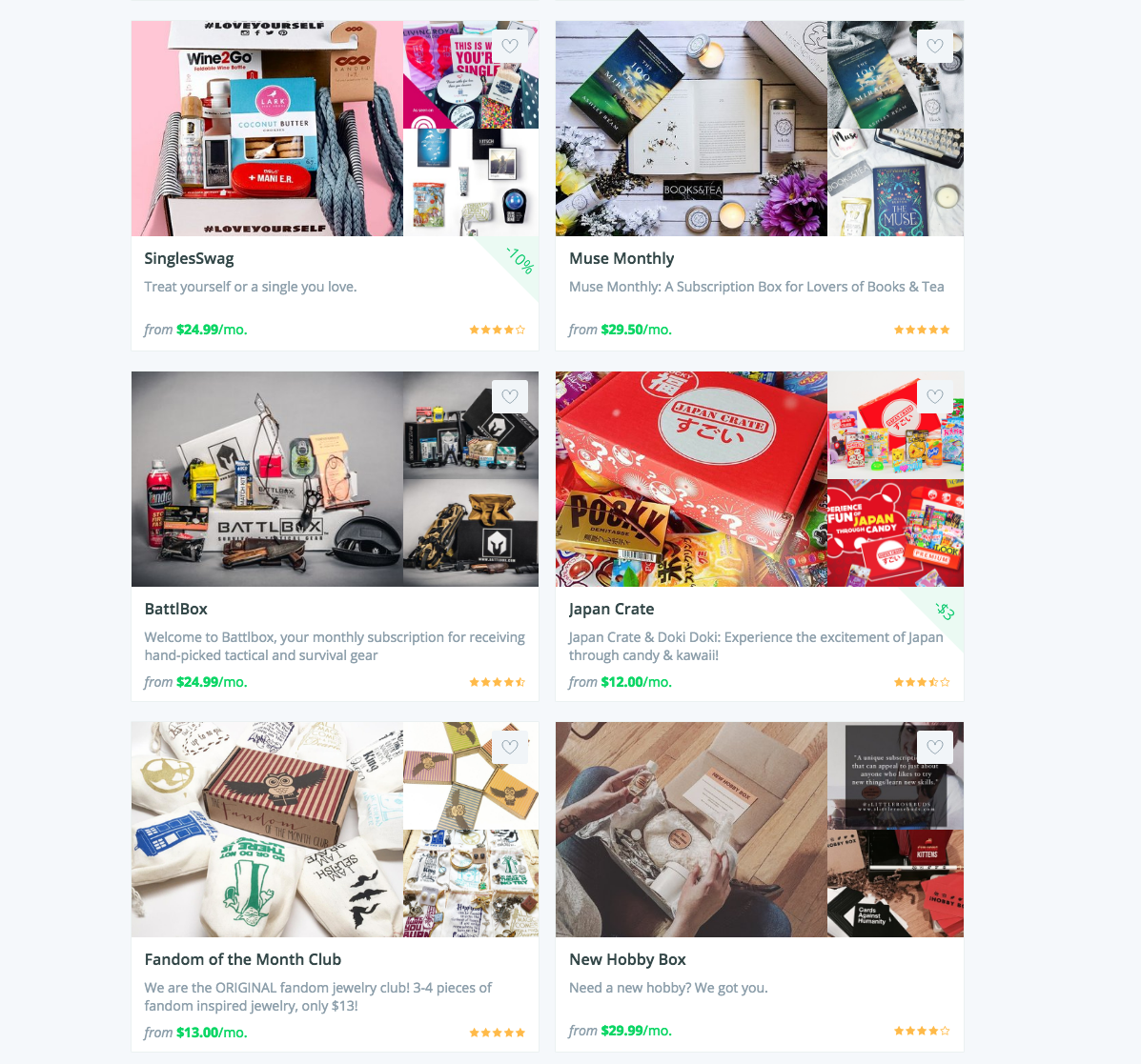
Let’s look at the following screenshot of the Cratejoy Marketplace:
What’s the first box that catches your eye? More often than not, it’s going to be Japan Crate. Even though it’s not the first box on the list, you process all of the images in parallel and you automatically single it out because of the bright red color that makes it stand out from other listings. But keep in mind that Japan Crate’s bold color scheme fits with the theme of the box.
Key Takeaways:
- Focusing your images around bright colors and contrast can help your listing stand out
- Make sure your color scheme fits with your brand to enhance perceived quality
Cratejoy is an all in one subscription commerce platform that includes everything you need to start your own subscription commerce business online. Try it free for 14 days.
All Things Considered
Your listing images are important. Maintaining the optimal number of images can be an advantage, but paying careful attention to the content of your pictures goes even further. Implementing these three strategies can boost your conversions and sales:
- In most cases, your listing should have between 8-10 photos.
- Capturing an emotion or certain feeling in your photos helps make an impact on customers and encourages them to subscribe.
- Using bright colors and contrasting products and backgrounds helps your listing stand out in the Marketplace!
